The chart method of note taking turns a lecture or a chapter into a table. Each topic gets a row, each feature you want to compare gets a column, and the facts go in the cells where the two meet. University guides call it charting or grid notes. Researchers who study it call the result a matrix.
It suits material that describes several things in the same terms. The research summarized below is more favorable to studying from a chart than to drawing one during a live lecture, so the method is also worth knowing as a way to reorganize notes after class.
Quick answer: List the topics down the side and the categories across the top, then fill each cell with a few words. Use a chart when several things are compared on the same features. In an experiment by Kauffman and Kiewra (2010), students who studied a matrix did better on tests of facts and relationships than students who studied an outline or the text.
What the chart method of note-taking is
The University of York's guide describes the charting method, or grid notes, as dividing a page into columns and rows, like a spreadsheet in which each column holds a category of information and each row covers one topic.
Guides differ on which way round the grid goes. York puts topics in rows. The University of Guelph's library, in its steps for creating a matrix chart, puts each concept at the top of a column and labels the rows with the things you need to know about it. Either works, as long as one direction lists the things being compared and the other lists the features they are compared on.
Charting is one of five formats in this site's comparison of different note-taking methods, which covers the other four.
Setting up the columns and rows
These steps combine the York guide, Sheridan College's library guide to the charting method and Cal Poly's page on note-taking systems.
- Find the topics and the categories. Look through the reading, the slides or your earlier notes for the main topic and its subtopics. Sheridan's guide suggests asking what categories of information can be noted about, or compared between, those subtopics.
- Draw the grid before class. Make one row for each topic and one column for each category. York and Sheridan both add an extra column for notes that fit none of the headings.
- Fill the cells with words and phrases. Cal Poly says to record words, phrases and main ideas under the right heading as you listen. Guelph's advice is to summarize so the chart stays manageable.
- Put the topics in a natural order. Order of time, size or distance are examples. The reason is in the research section below.
- Fill the gaps afterward. York's last step is to review the chart and complete it. Guelph notes that an empty box could mean a gap in what you know.
You can also build the chart after class. The University of Toronto Mississauga's academic skills center presents the matrix as a system used after a lecture to organize and review, and says it can be hard to use during one. Sheridan's guide adds that charting can turn linear notes, such as notes taken with the outline method, into a chart that shows connections.
When the material suits a chart
| Situation | Does a chart fit? | Source |
|---|---|---|
| Several topics are described by the same features | Yes | York; Kauffman and Kiewra (2010) |
| The test will cover both facts and relationships | Yes | Cal Poly |
| The lecture has a distinct format, such as chronological | Yes | Cal Poly |
| You are combining information from several sources | Yes | York |
| You can't identify the categories in advance | No | York, Sheridan |
| The lecture is unstructured or raises topics unexpectedly | No | York |
| The subject depends on graphs or formulas | No | York; Sheridan names physics and math |
| There is one topic and nothing to compare it with | No | Kauffman and Kiewra (2010) |
Watch out: The guides pull in two directions on fast lectures. Cal Poly lists heavy content presented fast as a time to use a chart, and York calls the method ideal for dense content delivered quickly. York also says a chart is difficult to adapt when a quick talk introduces new topics unexpectedly. A reasonable reading is that speed is manageable only if you knew the categories before the lecture started.
A filled-in example
The chart below is an example made for this article. It shows notes for a sample astronomy lesson on the four planets nearest the Sun, and every number comes from NASA's Planetary Fact Sheet. The entries in the last column were added by reading down the other columns.
| Planet | Distance from Sun (million km) | Diameter (km) | Length of day (hours) | Moons | Mean temperature (°C) | Extra notes |
|---|---|---|---|---|---|---|
| Mercury | 57.9 | 4,879 | 4,222.6 | 0 | 167 | Smallest of the four |
| Venus | 108.2 | 12,104 | 2,802.0 | 0 | 464 | Hottest of the four |
| Earth | 149.6 | 12,756 | 24.0 | 1 | 15 | Largest of the four |
| Mars | 228.0 | 6,792 | 24.7 | 2 | −65 | Coldest of the four |
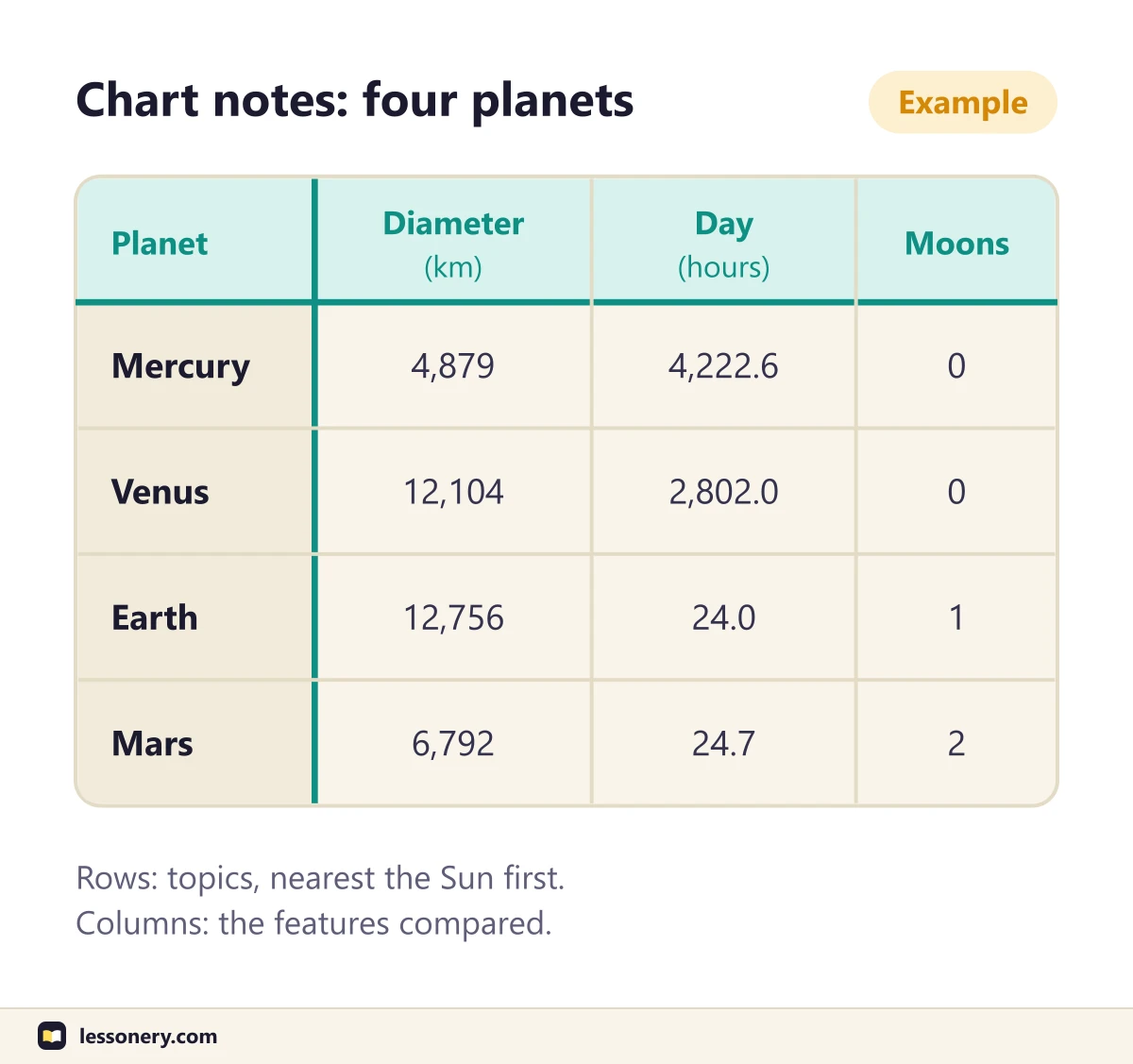
Read along a row and you get the facts about one planet, as an outline would give them. Read down a column and you get comparisons that an outline would spread over four places:
- Length of day. Earth and Mars are within an hour of each other. Mercury and Venus have days thousands of hours long.
- Temperature. Venus is hotter than Mercury although, by these figures, it is almost twice as far from the Sun.
- Moons. The two planets nearest the Sun have none.
- Diameter. Venus and Earth are nearly the same size.
These are descriptions of the numbers, not explanations: the fact sheet does not say why Venus is hotter.
The rows follow distance from the Sun, a natural order for this topic.
What research on matrix notes found
The research described here comes from Kenneth Kiewra, an educational psychologist at the University of Nebraska-Lincoln, and his colleagues. The four studies in the table were all done with undergraduates.
| Study | Who took part | What was compared | Result |
|---|---|---|---|
| Kiewra and colleagues (1988) | 44 undergraduates | Reviewing a lecture with the complete text, an outline, a matrix or no notes | Any notes beat none; outline and matrix gave higher recall; matrix gave the greatest transfer |
| Kiewra and colleagues (1989) | Undergraduates | Taking conventional, skeletal or matrix notes | No format had an advantage for lecture material |
| Kiewra and colleagues (1995) | 195 undergraduates in two experiments | An outline framework and a condensed matrix framework for taking notes | The outline framework produced more note-taking |
| Kauffman and Kiewra (2010) | 72 undergraduates in the first experiment | Studying a text, an extracted text, an outline or a matrix | The matrix group did best on tests of facts and relationships |
Studying from a matrix
The evidence here favors the chart. In Kiewra and colleagues (1988), the notes were supplied by the researchers, and students used them to review a lecture.
Kauffman and Kiewra (2010) tested why a matrix helps. All 72 students heard a 13-minute recorded lecture on six wildcats while reading the text of it, about 2,000 words long. Each then studied one display for 15 minutes without taking notes: the text, a version with only the important ideas left in, an outline or a matrix. Tests of facts and of relationships followed at once, again a week later without warning, and a third time after 10 more minutes of study.
The matrix group outperformed the outline group on all three kinds of test, and both beat the group that studied the extracted ideas. The authors' explanation is position on the page. In the matrix, everything about one category, such as each cat's call, sat in a single row. In the outline the same facts were in six separate places.
A second experiment with 54 more undergraduates compared matrices only. Students did better when the topics ran in a logical order, such as heaviest cat to lightest, than when they were arranged at random. That is the reason for step 4 above.
The authors state two limits. The displays were made by the researchers, and they write that "it is not known empirically whether students can generate them as successfully on their own." A matrix is also only appropriate when several topics are compared across categories.
Taking notes in chart form
The evidence here is weaker. Kiewra and colleagues (1989) ran two experiments with undergraduates, one with a videotaped lecture and one with a printed text, in which students took conventional notes or used a skeletal or a matrix framework. According to the paper's abstract, no format had an advantage when the material came from a lecture. With the text, conventional notes had some advantage, and reading the material twice without taking notes had a clear one. The details about participants and materials are from the study's ERIC record.
In Kiewra and colleagues (1995), an outline framework that listed subtopics in the order of the lecture led to more note-taking than a condensed matrix framework with fewer subtopics.
Charts that students build themselves
A review by Kiewra, Colliot and Lu (2018) describes a study routine called SOAR: select, organize, associate and regulate. The organize step turns linear notes into a graphic organizer such as a matrix.
The review reports two studies of it. In one, students who studied SOAR materials they had helped create for a lesson on wildcats learned 29% more facts and 63% more associations than students who used their own preferred methods. In the other, after 30 minutes of training, students who created their own SOAR materials for a lesson on apes learned 8% more facts and 31% more associations than students who used their preferred methods. The percentages are from the review, not from the two papers, and both studies test the whole routine, of which the chart is one part.
Taken together, and this is reasoning, the studies support charts more firmly as something to study from than as a way to write during a lecture.
Studying from your chart
Guelph's library lists five ways to study with a matrix chart: summarize, recall, identify gaps, compare and contrast, and test yourself. For the last one it suggests making a blank chart and filling it in, or covering parts of the chart to see what you remember.
With the example above, that means redrawing the grid with only the planet names and column headings, then filling in the cells from memory. Questions that run down a column work too, such as "Which of the four has the longest day?"
Self-testing of this kind is the technique that Dunlosky and colleagues (2013) rated as high utility in their review of ten learning techniques. The article on the active recall method explains it, and the cue column in the Cornell note-taking system is another way to build it into your notes.
Frequently asked questions
Is the chart method the same as the matrix method?
In practice, yes. York's guide calls the format charting or grid notes. Kauffman and Kiewra call it a matrix and define it as a two-dimensional table that lets topics be compared along one or more categories.
Should topics go in rows or in columns?
Guides do it both ways. York and Sheridan put topics in rows, and Guelph puts them in columns. The wildcat matrix in Kauffman and Kiewra's paper has the topics across the top.
Can you use the chart method of note-taking during a lecture?
You can if you know the categories beforehand, which is the condition York and Sheridan both set. If you don't, take notes another way and build the chart afterward. The article on taking notes in class covers what to do during the lecture itself.
Which subjects suit the chart method?
York names subjects with clear, structured information and tasks that compare facts, statistics or concepts. It says the format is harder to work with in subjects that need graphs or formulas. Kauffman and Kiewra give planets compared on diameter and rotation speed as one example of material that fits.